


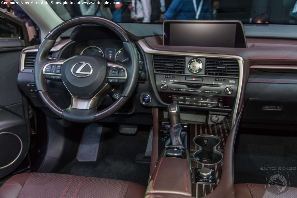
X5 interior is more coherent definitely, but the placement of controls and layout is generally the same.
RX (top to bottom)
Screen
Air outlets
Audio
Climate
X5 (top to bottom)
Screen
Air outlets
Climate
Audio
RX (top to bottom)
Screen
Air outlets
Audio
Climate
X5 (top to bottom)
Screen
Air outlets
Climate
Audio

SW17LS
Lexus Fanatic
close


Today
- Join DateMay 2012
- LocationMaryland
- Posts:68,730
-
iTrader Positive Feedback0
-
iTrader Feedback Score(0)
-
Likes:1,591
-
Liked:4,072 Times in 3,031 Posts
It's not the layout, it's the design. I just hate that big screen popping out of a big flat dash top.


Quote:
It's obviously very subjective, but the fact of the matter is that this is a huge trend right now. Having the "tablet" type screens that "pop out" of the dash allows the overall height of the instrument panel to be lower, which creates a feeling of openness and aids in outward visibility. Originally Posted by SW15LS
It's not the layout, it's the design. I just hate that big screen popping out of a big flat dash top.
The LS/GS/ES style of completely embedding the screen within a hooded IP is not conducive to that feeling.

rominl
exclusive matchup
close


Yesterday
- Join DateMay 2002
- LocationLovely OC
- Posts:81,867
-
iTrader Positive Feedback100
-
iTrader Feedback Score(4)
-
Likes:143
-
Liked:458 Times in 336 Posts
i agree, it looks like the tablet pop up feel is the trend now, though i am not used to it yet
SW17LS
Lexus Fanatic
close
Today
- Join DateMay 2012
- LocationMaryland
- Posts:68,730
-
iTrader Positive Feedback0
-
iTrader Feedback Score(0)
-
Likes:1,591
-
Liked:4,072 Times in 3,031 Posts
I understand that it's a trend, doesn't mean I have to like it. I understand the reasons, I just don't agree about the approach in a lot of cases.
Some people have it figured out too. Looks fine in the Audis, looks fine in the IS, RC and NX. Looks fine in the X5. Don't care for the way it's done on the new RX or the MB C or CLS, CLA
Some people have it figured out too. Looks fine in the Audis, looks fine in the IS, RC and NX. Looks fine in the X5. Don't care for the way it's done on the new RX or the MB C or CLS, CLA

CL Community Team
bitkahuna
CL Community Team
close
Today
- Join DateFeb 2001
- Posts:80,836
-
iTrader Positive Feedback100
-
iTrader Feedback Score(20)
-
Likes:2,299
-
Liked:4,014 Times in 2,730 Posts
Quote:


Originally Posted by Hoovey2411
I agree the RX's screen is oddly placed, though it seems benchmarked against a certain German 
maybe it's a shot angle difference but the top of the bmw screen isn't above the dash behind it whereas the rx is. the rx one looks really obstructive of the view.

SW17LS
Lexus Fanatic
close
Today
- Join DateMay 2012
- LocationMaryland
- Posts:68,730
-
iTrader Positive Feedback0
-
iTrader Feedback Score(0)
-
Likes:1,591
-
Liked:4,072 Times in 3,031 Posts
Its not really above the dash in the X5 no, its even with the top of the dash.
CL Community Team
bitkahuna
CL Community Team
close
Today
- Join DateFeb 2001
- Posts:80,836
-
iTrader Positive Feedback100
-
iTrader Feedback Score(20)
-
Likes:2,299
-
Liked:4,014 Times in 2,730 Posts
Quote:
exactly, but the rx one looks way above (and obstructive)Originally Posted by SW15LS
Its not really above the dash in the X5 no, its even with the top of the dash.
SW17LS
Lexus Fanatic
close
Today
- Join DateMay 2012
- LocationMaryland
- Posts:68,730
-
iTrader Positive Feedback0
-
iTrader Feedback Score(0)
-
Likes:1,591
-
Liked:4,072 Times in 3,031 Posts
Yeah I agree. I don't see why it needs to be higher than the gauge cluster. To me when its even with the gauge cluster it looks like it makes sense but with it that high it almost looks like one of these cars with a center IP.

Quote:
urgh... it is slightly lower than the top of the steering wheel..is steering wheel obstructing your view?Originally Posted by bitkahuna
exactly, but the rx one looks way above (and obstructive)
I dont think so... they tried to put it as high as possible so you dont have to glance down.
on the other hand, it is same height as combination meters in X5... so it is completely pointless since it is not higher than traditionally integrated screen, just looks like a tablet. And you still have to glance down to view it.
SW17LS
Lexus Fanatic
close
Today
- Join DateMay 2012
- LocationMaryland
- Posts:68,730
-
iTrader Positive Feedback0
-
iTrader Feedback Score(0)
-
Likes:1,591
-
Liked:4,072 Times in 3,031 Posts
We'll just have to agree to disagree here. I think its poorly integrated and ugly. I'd rather look slightly down on the screen and have a more integrated and attractive dash. These vehicles have a HUD for turn by turn directions.
Dash height on the X5 is still lower than if the screen was hooded. All you have to do is sit in a 5 series with the hooded screen and an X5 with the tablet screen to feel that.
Dash height on the X5 is still lower than if the screen was hooded. All you have to do is sit in a 5 series with the hooded screen and an X5 with the tablet screen to feel that.

Lexus Test Driver
It could be a human interface design issue - a center dash screen placed higher up only requires the eyes to move horizontally, and then quickly focus on the road ahead, whereas the X5's screen requires a down-right movement to view and up-left movement to look at the road again. The RX screen could be less distracting to use because it's easier to look back at the road. A smartphone on a vent mount in the RX would be at the same height as the X5 screen.

Quote:
X5 Navigation is on the same baseline as gauges so it no less distracting then looking at what speed you are at. RX should be easier to glance at real quick as its placed on the same level as your eyes when looking on the road but Im suspecting it could take away from your whole view or constantly be in your view. On NX its not a problem since its a lot smaller screen but this thing on RX is huge due to display size and asymmetric shape.Originally Posted by chromedome
It could be a human interface design issue - a center dash screen placed higher up only requires the eyes to move horizontally, and then quickly focus on the road ahead, whereas the X5's screen requires a down-right movement to view and up-left movement to look at the road again. The RX screen could be less distracting to use because it's easier to look back at the road. A smartphone on a vent mount in the RX would be at the same height as the X5 screen.
The future of these things is full-on windshield projection with augmented reality, its gonna happen sooner or later.

Lexus Champion
Quote:
Originally Posted by bitkahuna
exactly, but the rx one looks way above (and obstructive)
Quote:
Originally Posted by SW15LS
Yeah I agree. I don't see why it needs to be higher than the gauge cluster. To me when its even with the gauge cluster it looks like it makes sense but with it that high it almost looks like one of these cars with a center IP.
Quote:
Originally Posted by chromedome
It could be a human interface design issue - a center dash screen placed higher up only requires the eyes to move horizontally, and then quickly focus on the road ahead, whereas the X5's screen requires a down-right movement to view and up-left movement to look at the road again. The RX screen could be less distracting to use because it's easier to look back at the road. A smartphone on a vent mount in the RX would be at the same height as the X5 screen.
Quote:
The future of these things is full-on windshield projection with augmented reality, its gonna happen sooner or later.
People like their navigation system screens at eye-level. You will notice that if you look at where many drivers place their portable aftermarket (TomTom, Garmin) units -- they suction cup them to the middle of the windshield -- in the middle horizontally and vertically (below the rearview mirror). It is right at eye-level but also blocks a significant portion of the windshield.Originally Posted by Vladi
X5 Navigation is on the same baseline as gauges so it no less distracting then looking at what speed you are at. RX should be easier to glance at real quick as its placed on the same level as your eyes when looking on the road but Im suspecting it could take away from your whole view or constantly be in your view. On NX its not a problem since its a lot smaller screen but this thing on RX is huge due to display size and asymmetric shape.The future of these things is full-on windshield projection with augmented reality, its gonna happen sooner or later.
Here in the province of Ontario, drivers are not allowed to place items in the middle (vertically) of the windshield where it would block forward visibility of traffic -- or even more importantly, pedestrians -- yet that is where many drivers stick their portable GPS units.
I agree that to get any displays higher up will require see-through head-up displays but more research will have to be done. There are studies that show that current HUDs can be very distracting so that using current ones may be equivalent to holding and talking on a mobile phone, or fiddling with the radio or CD player.
SW17LS
Lexus Fanatic
close
Today
- Join DateMay 2012
- LocationMaryland
- Posts:68,730
-
iTrader Positive Feedback0
-
iTrader Feedback Score(0)
-
Likes:1,591
-
Liked:4,072 Times in 3,031 Posts
Quote:
People put their portable units on the windshield because thats where it makes sense to mount them.Originally Posted by Sulu
People like their navigation system screens at eye-level. You will notice that if you look at where many drivers place their portable aftermarket (TomTom, Garmin) units -- they suction cup them to the middle of the windshield -- in the middle horizontally and vertically (below the rearview mirror). It is right at eye-level but also blocks a significant portion of the windshield.
Obviously, all "people" don't prefer this. I don't, and based on the grousing from plenty of other people here and elsewhere in the automotive press and forum verse plenty of other people don't either. Top of the dashboard is just fine for me.