

Is it time for a new Ford logo?


Thread Starter
Lexus Champion
Joined: Sep 2006
Posts: 2,025
Likes: 0
From: MIchigan
I was stuck in traffic the other day behind a Ford F150. I was looking at it wondering if it is time for a new Ford Logo?
I ask this because with all that has been going on with the American automakers it seems that Ford is the only one of the BIG three doing things right.
It seems to me that the old logos represents the past...
What does everyone else think?

The current logo has been out since 2003. But it still to similar to the 1970's logo
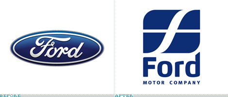
Is it time for something new and different which seperates the brand from the past?
I ask this because with all that has been going on with the American automakers it seems that Ford is the only one of the BIG three doing things right.
It seems to me that the old logos represents the past...
What does everyone else think?
The current logo has been out since 2003. But it still to similar to the 1970's logo
Is it time for something new and different which seperates the brand from the past?
Last edited by pagemaster; Apr 19, 2009 at 12:45 PM.
Lexus Fanatic


Joined: Oct 2003
Posts: 94,222
Likes: 220
From: Virginia/D.C. suburbs
This one was used in the late 1950s and into the 1960's (I remember it on some of the 60's-vintage Fords I grew up with). This image, of course, is a fabric patch, but the actual badge on Fords of that era was identical.

Last edited by mmarshall; Apr 19, 2009 at 12:51 PM.

Out of Warranty


Joined: Aug 2001
Posts: 14,925
Likes: 13
From: Houston, Republic of Texas
Logos are funny things. First of all they represent the company's branding and they can be guarded with extreme jealousy. If you mess with the Coca Cola logo, their corporate attorneys are on you like white on rice. It seems The Coca Cola Company believes they have something like $15 BILLION invested in their brand, and varying that script signature by a millimeter gets you drizzled with honey and staked to an ant bed.
At the same time, logos are often the first target of new ad agencies. In order to separate their efforts from those of a previous agency, most seek to "rebrand and reposition" their client. Case in Point, Federal Express hired a new ad agency and became FedEx a few years back. The company spent something like $40 million repainting their trucks and airplanes. About that time somebody discovered they had warehouses filled with their shipping boxes and containers, waybills, and invoices - not to mention letterhead and a variety of envelopes - all of which had to go to the recycler. Another $10 million. What did it gain the company? Nada. Maybe a fresh coat of paint and a lot of new signs. Increase in business? None detectable.
Rebranding and repositioning by a new agency has been called "peeing on your post". Much like a dog marking his territory, changing the logo is the agency's way of marking theirs . . . except the company pays for it and gains very little, if anything.
Ford Motor Company has a long and honorable history behind that old "Model T" script. They drifted away from it in the '50's for a while, but by the late '60's they recovered that proud heritage and married it to their racing effort. "Powered by Ford" became a legend. If I were making a change, I wouldn't mess with that script logo. Subtle changes could be made in the rendering of the medallion, but the script and the blue oval are too important to the brand. They can get plenty of "style" out of their model logotypes.
Rookie
Joined: Apr 2005
Posts: 74
Likes: 0
From: CA
Logos are funny things. First of all they represent the company's branding and they can be guarded with extreme jealousy. If you mess with the Coca Cola logo, their corporate attorneys are on you like white on rice. It seems The Coca Cola Company believes they have something like $15 BILLION invested in their brand, and varying that script signature by a millimeter gets you drizzled with honey and staked to an ant bed.
At the same time, logos are often the first target of new ad agencies. In order to separate their efforts from those of a previous agency, most seek to "rebrand and reposition" their client. Case in Point, Federal Express hired a new ad agency and became FedEx a few years back. The company spent something like $40 million repainting their trucks and airplanes. About that time somebody discovered they had warehouses filled with their shipping boxes and containers, waybills, and invoices - not to mention letterhead and a variety of envelopes - all of which had to go to the recycler. Another $10 million. What did it gain the company? Nada. Maybe a fresh coat of paint and a lot of new signs. Increase in business? None detectable.
Rebranding and repositioning by a new agency has been called "peeing on your post". Much like a dog marking his territory, changing the logo is the agency's way of marking theirs . . . except the company pays for it and gains very little, if anything.
Ford Motor Company has a long and honorable history behind that old "Model T" script. They drifted away from it in the '50's for a while, but by the late '60's they recovered that proud heritage and married it to their racing effort. "Powered by Ford" became a legend. If I were making a change, I wouldn't mess with that script logo. Subtle changes could be made in the rendering of the medallion, but the script and the blue oval are too important to the brand. They can get plenty of "style" out of their model logotypes.
At the same time, logos are often the first target of new ad agencies. In order to separate their efforts from those of a previous agency, most seek to "rebrand and reposition" their client. Case in Point, Federal Express hired a new ad agency and became FedEx a few years back. The company spent something like $40 million repainting their trucks and airplanes. About that time somebody discovered they had warehouses filled with their shipping boxes and containers, waybills, and invoices - not to mention letterhead and a variety of envelopes - all of which had to go to the recycler. Another $10 million. What did it gain the company? Nada. Maybe a fresh coat of paint and a lot of new signs. Increase in business? None detectable.
Rebranding and repositioning by a new agency has been called "peeing on your post". Much like a dog marking his territory, changing the logo is the agency's way of marking theirs . . . except the company pays for it and gains very little, if anything.
Ford Motor Company has a long and honorable history behind that old "Model T" script. They drifted away from it in the '50's for a while, but by the late '60's they recovered that proud heritage and married it to their racing effort. "Powered by Ford" became a legend. If I were making a change, I wouldn't mess with that script logo. Subtle changes could be made in the rendering of the medallion, but the script and the blue oval are too important to the brand. They can get plenty of "style" out of their model logotypes.
Jitters

Trending Topics
Lexus Champion
Joined: Mar 2005
Posts: 8,695
Likes: 2
From: CA
This reminds me of the dropping of the name "Taurus" and then bringing it back again. The Ford oval reminds me of the Maytag logo and GE symbol...something that's been around for a long time and its stands for something American industrial...
...I do think yes it would cost millions to redo the logo and they are in the best shape of the big 3, but still...if they did it I hope it's a better job than the new Pepsi logo or the new Xerox one.
...I do think yes it would cost millions to redo the logo and they are in the best shape of the big 3, but still...if they did it I hope it's a better job than the new Pepsi logo or the new Xerox one.

Funny this thread came about. The other day my wife said that Chevy and Ford both need new emblems. She told me she wouldn't' drive either car because the emblems are ugly, large and just outdated. If she thinks this way I'm sure there are plenty more out there that feel the same.
Rookie
Joined: Apr 2005
Posts: 74
Likes: 0
From: CA
^^Now that's a very interesting perspective...
I've owned quite a few cars in my liftetime and I never bought one based on how the logo looked. In all honesty, I would prefer no badging on the car at all...JMO...
Jitters
I've owned quite a few cars in my liftetime and I never bought one based on how the logo looked. In all honesty, I would prefer no badging on the car at all...JMO...
Jitters
Thread Starter
Lexus Champion
Joined: Sep 2006
Posts: 2,025
Likes: 0
From: MIchigan
None whatsoever? I don't think so. The FedEx name signified the changed from Federal Express (an operating company) to FedEX Corp (a huge corportation). Following the changed, FedEx aquired many companies such FedEx Freight, FedEx Ground, FedEx Kinkos (Now FedEx office) which are all separate companies operating under the FedEx umbrella.
I would not change the name for an immediate increase in sales. That is not the point. The point is that Ford needs to severe its "poor quality" past with a new a logo representing all the things they are doing right.
except the company pays for it and gains very little, if anything

Lexus Champion


Joined: Aug 2006
Posts: 12,492
Likes: 251
From: Illinois