


Lexus project: need some feedback!
As some of you know I am working on an international competition project for DECA (school competition project), and it will be a business plan for a Lexus dealership. I have completed most of the factual information, pricing reports, and other analytical data, but am not at the point of designing advertisements for the dealership. These are three that I have created already and am looking for some feedback and constructive criticism.
Thanks in advance.


Thanks in advance.
Pole Position

Joined: Dec 2002
Posts: 3,056
Likes: 0
From: Washington
I think the first one people will associate the most with while the others are sporty and although we like them, they won't have as broad of a focus as #1. Also, on number one, several of your "h"s looks like "n"s, just a heads up. One of my friends did Lexus for their DECA project 2 years ago too, but it wasn't as good looking as these ads, nice job.
James
James
i like all three... all three really speak out and truly show what lexus is and stuff.. but if we're talking about advertisement here, i wouldnt go with number 2.. it really is nice but i think its better to tshow the entire car like number 3 or number 1... when i see car ads, i want to see the product.. not the words and pretty font.. consumers want to see what it is that your advertising... the 2nd is an awesome if you were doing it for like rims or headlights or something... but if we're talking about a new breed of luxury and suv's and stuff, show the entire car like ad 1 and 3. secondly... i like 3 over 1. It looks more professional? like number 1 you can see the cars and what not but it isnt saying anything... it does say in the paragraph at bottom that the suv's are luxurious and that they all come with different attitudes that might suit the buyer and stuff... but we're talking about trying to get the people to come and truly get a look and feel for the products... i think number 1 gives off a bit too much... the picture and background is all pretty and stuff but number 3 really gives that awe and attraction that strong advertisement does. And it makes me want to know about it more. The cool image of the car and the banner up top saying like (the new breed of luxury sport sedan) really gives the ad a kick...
as you can probably tell.. i like number 3... but they are all really good... great work... !
as you can probably tell.. i like number 3... but they are all really good... great work... !
Trending Topics

Lead Lap
Joined: May 2003
Posts: 753
Likes: 0
From: Missouri
You've done nicely with all 3. But I, too, would go with the third job. There are a few aspects of the paragraph on #1 that leave a bad taste, and the second doesn't project the Lexus image. I think some that has to do with the fact that you can't see the "L" on the actual car. But #3, it's sophisticated, simple, clean, and who couldn't be drawn in by that shot of the new GS? Good job, man. . . 
ClubLexus Stories
Celebrating Lexus & Toyota from Around the Globe
Top 10 Most Confusing Things Lexus Has Ever Done!
Joe Kucinski
2026 Lexus ES Review: Lexus Re-Embraces Founding Principles
Michael S. Palmer
10 Lexus Bargains That are Cheaper Than a New Toyota RAV4
Joe Kucinski
8 Weirdest Things Lexus Has Ever Built
Verdad Gallardo
10 Lexus Designs That Have Aged Like Fine Wine
Verdad Gallardo
8 Tips for Improving Your Hybrid or Plug-in Hybrid's Efficiency!
Michael S. Palmer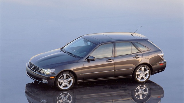
10 Best Lexus Models No One Remembers
Joe Kucinski
TRD Off-Road Premium: Best 2026 4Runner, Except This One Thing
Michael S. Palmer
Top 10 Lexus & Toyotas to Drive Before You Die!
Joe Kucinski


Lead Lap
Joined: Jun 2004
Posts: 543
Likes: 0
From: Alabama
i dont like the font that you have used on any of them but i think #3 is the best because many people dont pay attention to the autoshow news like alot of us on here and it shows the lines of the new GS really well
LexusFiend
LexusFiend
Lexus Champion
Joined: May 2002
Posts: 2,175
Likes: 0
From: Connecticut
Originally Posted by LexusFiend
i dont like the font that you have used on any of them but i think #3 is the best because many people dont pay attention to the autoshow news like alot of us on here and it shows the lines of the new GS really well
LexusFiend
LexusFiend
Also - consider your verbiage ...
For example, "tough" doesn't really have a luxury intonation; I'd use "difficult" instead. Tough connotes a texture - and so when I read "tough" in connection with a vehicle, I think "crappy leather" - and that's neither true nor what you're attempting to convey to your audience.
M.


Lexus Test Driver
Joined: Feb 2002
Posts: 1,106
Likes: 1
From: California
I think you've done a good job on all three. The one thing that just does not sound right in #2 and #3
is the use of the word "exclusively at..." I'm left with the impression that I can only buy the Lexus model at that specific dealership. If I were the owner of another Lexus dealer in the Atlanta area, I would take exception to that word. Imho an add using that type of language is more appropriate on a national level representing the Lexus Network instead of a single dealership.
is the use of the word "exclusively at..." I'm left with the impression that I can only buy the Lexus model at that specific dealership. If I were the owner of another Lexus dealer in the Atlanta area, I would take exception to that word. Imho an add using that type of language is more appropriate on a national level representing the Lexus Network instead of a single dealership.

Lexus Champion
Joined: May 2004
Posts: 2,265
Likes: 3
From: Washington
FFA > DECA ... lol playing. the third one is pretty good. They'd all look really sharp if you learned how to use photoshop and did the text using photoshop or a program called ulead. I think it's still around. On the first picture, be sure that your text fonts are somewhat similar, or atleast go together. You want to try and avoid the old times new roman or garamond for such advertisements.
Consider you target market too. Have you done a study of the demographics in the local area? It really helps you market the product to the customers better if you knew what they were like... age group? what's the top selling model for that dealership, what is the customer looking for in an SUV. that kinda thing.
good luck.