


Lexus project: need some feedback!
get rid of #1. I wouldn't use gorgeous in a common sentence, let alone an ad. (though there are other reasons).
#2 is on the right track words wise.
#3 is better on picture than words. something mising..... But #3 get's my vote.
#2 is on the right track words wise.
#3 is better on picture than words. something mising..... But #3 get's my vote.
Ok, I changed the font and the information in the copy. Is this one better or worse than the other? As much as I like the font, is it harder to read? Too hard to read?
Old:

New:

Old:
New:
Originally Posted by 1SICKLEX
Yes the font looks great. Just an idea, maybe use "Something wicked this way comes, again"!!
Hmmm....back to the drawing board.
Lead Lap
Joined: Jun 2004
Posts: 543
Likes: 0
From: Alabama
I like the white logo the best .... you now have a typo on the gx rx and lx one ... last line you say and and an .... i also dont like the wording of these sentences "Afterall, with three choices that are this compelling, the only difficult decision to make is yours. Thankfully, this is where we come in" ... it doesnt seem very concise and doesnt really flow very well with the rest of the ad ... also on the new GS one - i think the type on the bottom part is difficult to read so i would just make it bigger to fill out all the black extra space .... take my suggestions as you like
LexusFiend
LexusFiend
Latest version of the SUV Ad:

Latest version of the GS Ad:

This last one would be a 4 page print (magazine) campaign. The first two pages would be on the right page, and the last two would be full page.


Thoughts or comments?
Latest version of the GS Ad:
This last one would be a 4 page print (magazine) campaign. The first two pages would be on the right page, and the last two would be full page.
Thoughts or comments?
Last edited by MPLexus301; Jan 17, 2005 at 04:17 PM.
ClubLexus Stories
Celebrating Lexus & Toyota from Around the Globe
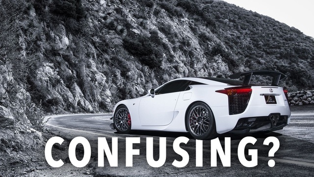
Top 10 Most Confusing Things Lexus Has Ever Done!
Joe Kucinski
2026 Lexus ES Review: Lexus Re-Embraces Founding Principles
Michael S. Palmer
10 Lexus Bargains That are Cheaper Than a New Toyota RAV4
Joe Kucinski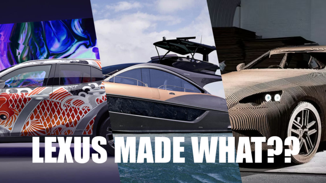
8 Weirdest Things Lexus Has Ever Built
Verdad Gallardo
10 Lexus Designs That Have Aged Like Fine Wine
Verdad Gallardo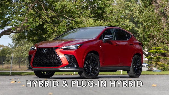
8 Tips for Improving Your Hybrid or Plug-in Hybrid's Efficiency!
Michael S. Palmer
10 Best Lexus Models No One Remembers
Joe Kucinski
TRD Off-Road Premium: Best 2026 4Runner, Except This One Thing
Michael S. Palmer
Top 10 Lexus & Toyotas to Drive Before You Die!
Joe KucinskiLexus Champion
Joined: May 2002
Posts: 2,175
Likes: 0
From: Connecticut
Originally Posted by MPLexus301
Finished version of the SUV Ad:
Much, much better.

Now, the verbiage isn't distracting or improper and the text requires that the audience view each of the Lexus vehicles you feature in the ad.
Good job!
M.


Thread
Thread Starter
Forum
Replies
Last Post
javyLSU
IS - 2nd Gen (2006-2013)
40
Aug 19, 2008 11:55 AM
javyLSU
GS - 3rd Gen (2006-2011)
11
Aug 18, 2008 01:17 PM